Yahoo Mobile Web Homepage
Date
January 2012 – July 2014
Location
Sunnyvale, CA
Role
Experience Designer
The Challenge
When you have a couple minutes between meetings, or while waiting for the bus, how can you quickly and efficiently get up to date on news they are interested in?
The goal of the Yahoo homepage was to help keep a user on top of the world around them. Working with our user research team, we sought to find out when people would visit the mobile homepage and why they would visit. We found that Yahoo’s homepage was often visited while a person had spare time – for example, when a person would be waiting for the bus or between meetings. Additionally, their intent when visiting the site on their mobile device is to catch up on what’s going on in the world. With so many things going on in our world, we set out to build an experience that would allow someone to quickly get up to speed during their spare time.
Phase 1 – Revamping the Article Experience
As we got into the project, we explored the shortcomings of the current mobile homepage. Where could we optimize the page to get the most pertinent information in front of a user, so they could get up to speed? We explored things such as different ways to get into an article, different ways to navigate between articles, and different way to present articles. Other than some extra navigation, we didn’t see much wrong with the current homepage.

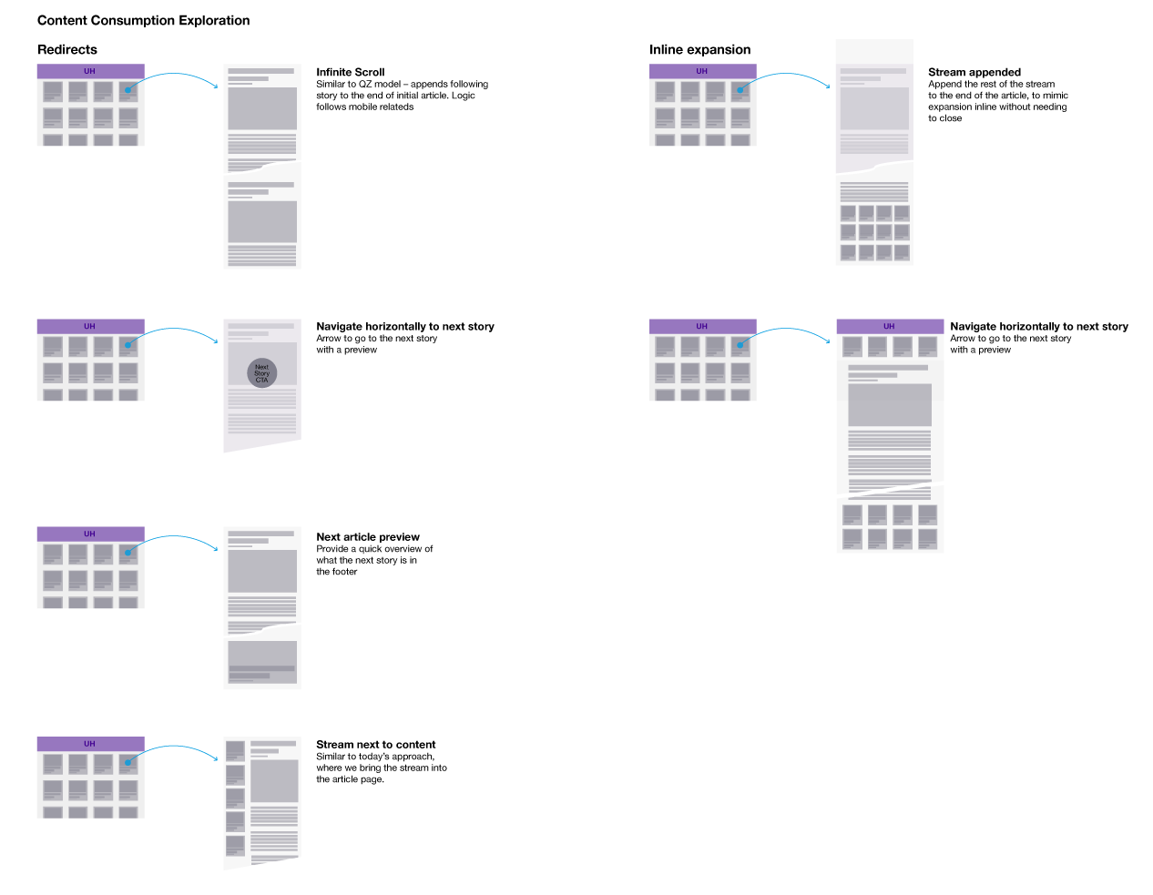
Exploring summaries that expand inline, to infinite streams of articles, the various ways a user might discover more content to quickly get all the news they need to be up-to-date.
Tapping to get into an article takes you to a slightly different experience. Previously, the user would be taken to the specific vertical that hosted the content. For example, if you clicked on a New York Yankees article, that article would belong to Yahoo Sports, and the user would be redirected there. The new experience kept the user in an experience consistent with the homepage. This now allowed a user to consume through articles coming from any source – not just the vertical that hosts the article. It also allowed us to allow users to navigate the stream of articles in a different way. Now once a user went into an article, they could navigate more stories from the stream by swiping.

A visualization of how the vertical stream on the homepage translates to the horizontal stream, once in an article experience.
Additionally, we cleaned up the some extra navigation on the homepage and added an icon to access widgets/apps, which was an effort to expose visitors to more content they may be interested in. A couple such examples would be weather or sports scores.

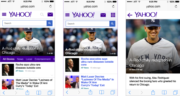
The old homepage to the left, the updated version in the middle, and the article page on the right. The update sought to start get users into an article quickly, then allow them to navigate from within an article. The thinking was that this would allow users to get more information without the need to pogo back-and-forth from the homepage to an article.
Phase 2 – Redesigning the Navigation
After that first phase was built and released, we looked to solve how a user might filter content on the homepage to show articles around a topic such as sports. While this may seem contradictory to the strategy of maintaining separate verticals, it worked to support a larger brand story of unifying everything under the Yahoo brand, while still giving each vertical tools to support their needs.
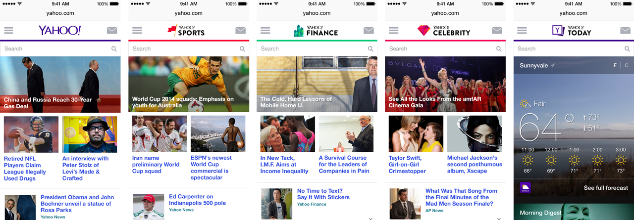
We went through various explorations around how we might provide a discoverable way to navigate between the various filters. The agreed initial solution involved a tabs across the top for each topic to filter by. We created various visualizations of it, and eventually a prototype which was put in front of users, but the team was ultimately moved to another project. The exploration eventually made it’s way into the Yahoo mobile app, where they use the pattern created by our team with a different visual treatment.

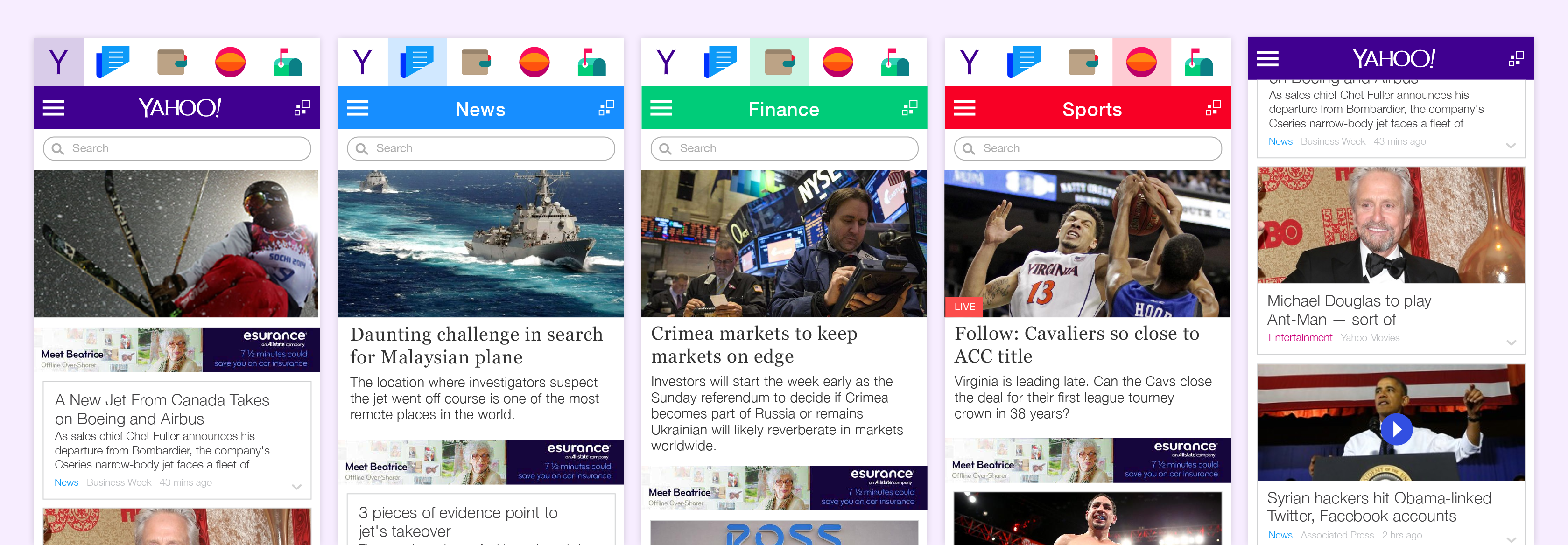
One of the navigation concepts where we explored an “attic” navigation for people looking for news around a specific topic. These tabs could be customized depending on a user’s interest.
© 2020 Jonathan Monzon